Feature adoption
Feature adoption
# Product Adoption Reports
These reports help you monitor how your product is being used and identify adoption patterns.
# Connections Overview
The top graph shows the evolution of the number of user connections over the last 12 weeks. You can:
- Filter by customer category
- Filter by a specific CSM
- Switch to the last 12 months using the drop-down menu at the top right

# Feature Usage
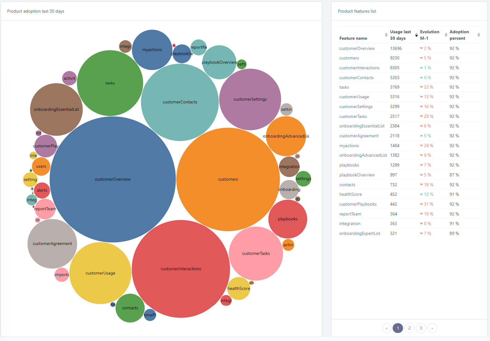
Below the connections graph, details of feature usage are displayed:
- Left side: Bubble size is proportional to feature usage, helping visualize adoption patterns.
- Right side: Table summarizing the number of uses per feature and evolution of connections compared to the previous month.

# Feature-Specific Insights
Clicking on a feature (bubble abbove) provides detailed information:
- Top left chart: Feature adoption over time in relation to overall application adoption
- Bottom left chart: Proportion of customers using the feature
- Right chart: List of customers who use the feature the most
